Ancillaries component customisation in React Native
About
This guide will show you how to customise the Ancillaries Component in React Native.
Prerequisites
You have a React Native project set up.
You have the @duffel/react-native-components on version
>1.1.0installed in your project.
Customising the Ancillaries Component
Code example
Here's an example of how you can customise the Ancillaries Component in React Native using the
theme prop:React
<DuffelAncillaries...theme={{primaryTextColor: '#FBFBFB',secondaryTextColor: '#A4A6A8',borderColor: '#2D2F30',modalBackgroundColor: '#131416',cardBackgroundColor: '#2D2F30',tooltipBackgroundColor: '#2D2F30',primaryButtonTextColor: 'black',primaryButtonBackgroundColor: 'lightblue',secondaryButtonTextColor: '#ccc',secondaryButtonBackgroundColor: '#111',secondaryButtonBorderColor: '#ccc',disabledSecondaryButtonTextColor: '#cccccc55',disabledSecondaryButtonBackgroundColor: '#11111155',disabledSecondaryButtonBorderColor: '#cccccc55',positiveCalloutTextColor: '#106331',positiveCalloutBackgroundColor: '#bde0af',}}/>
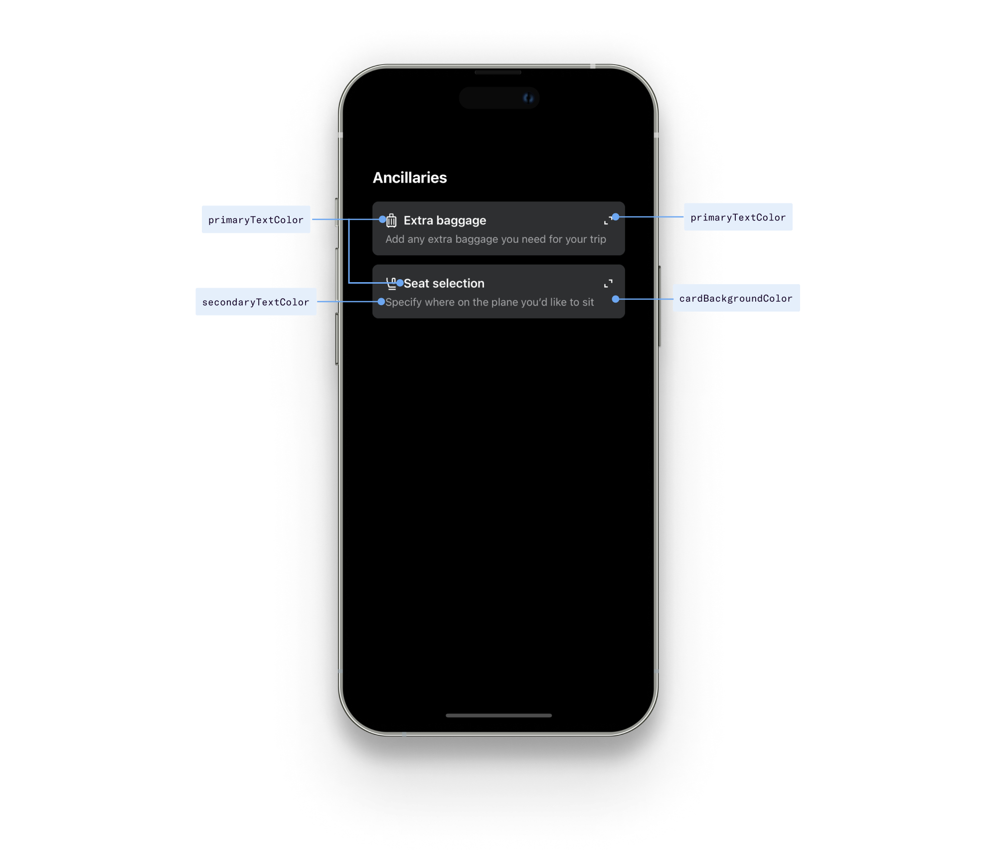
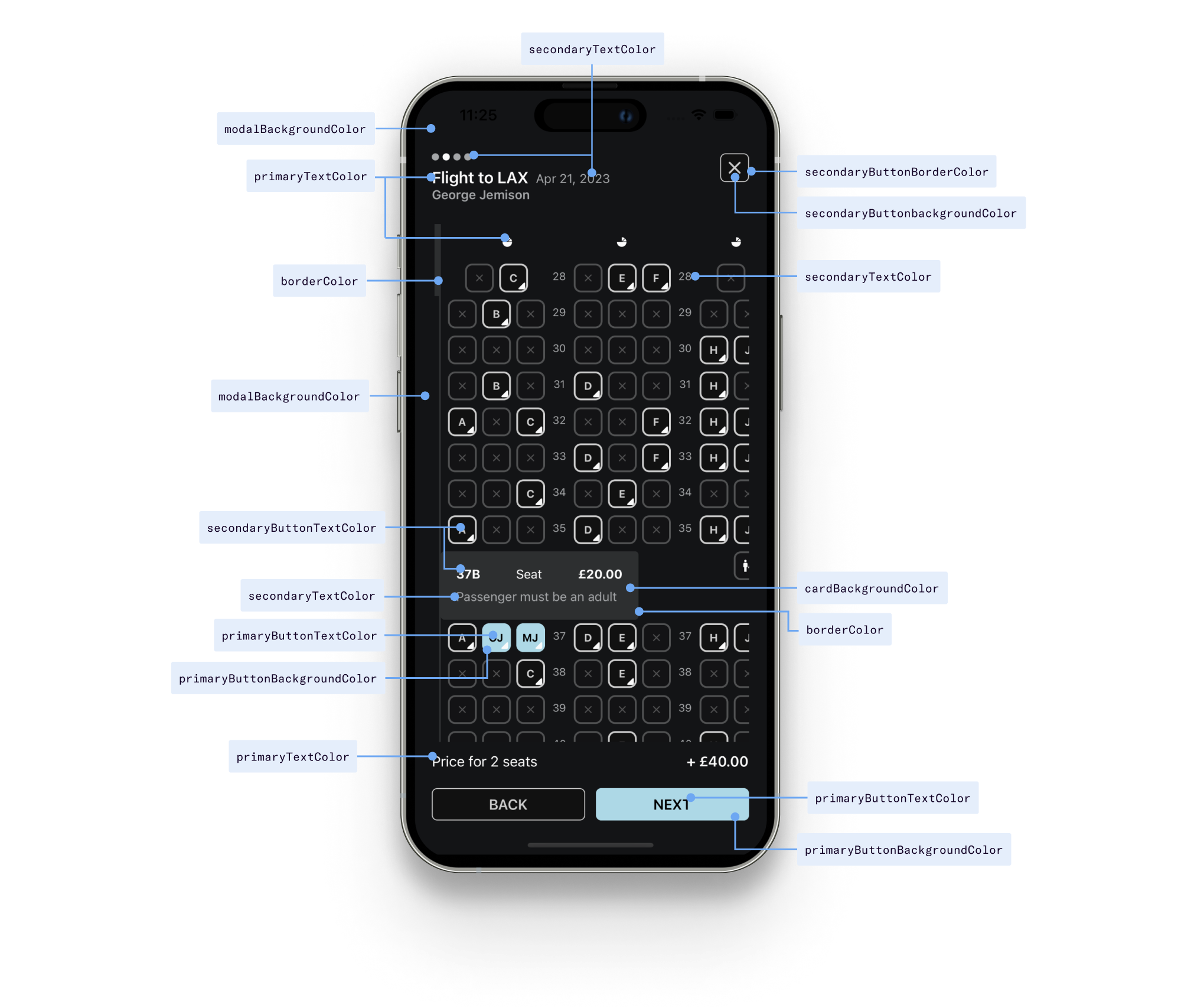
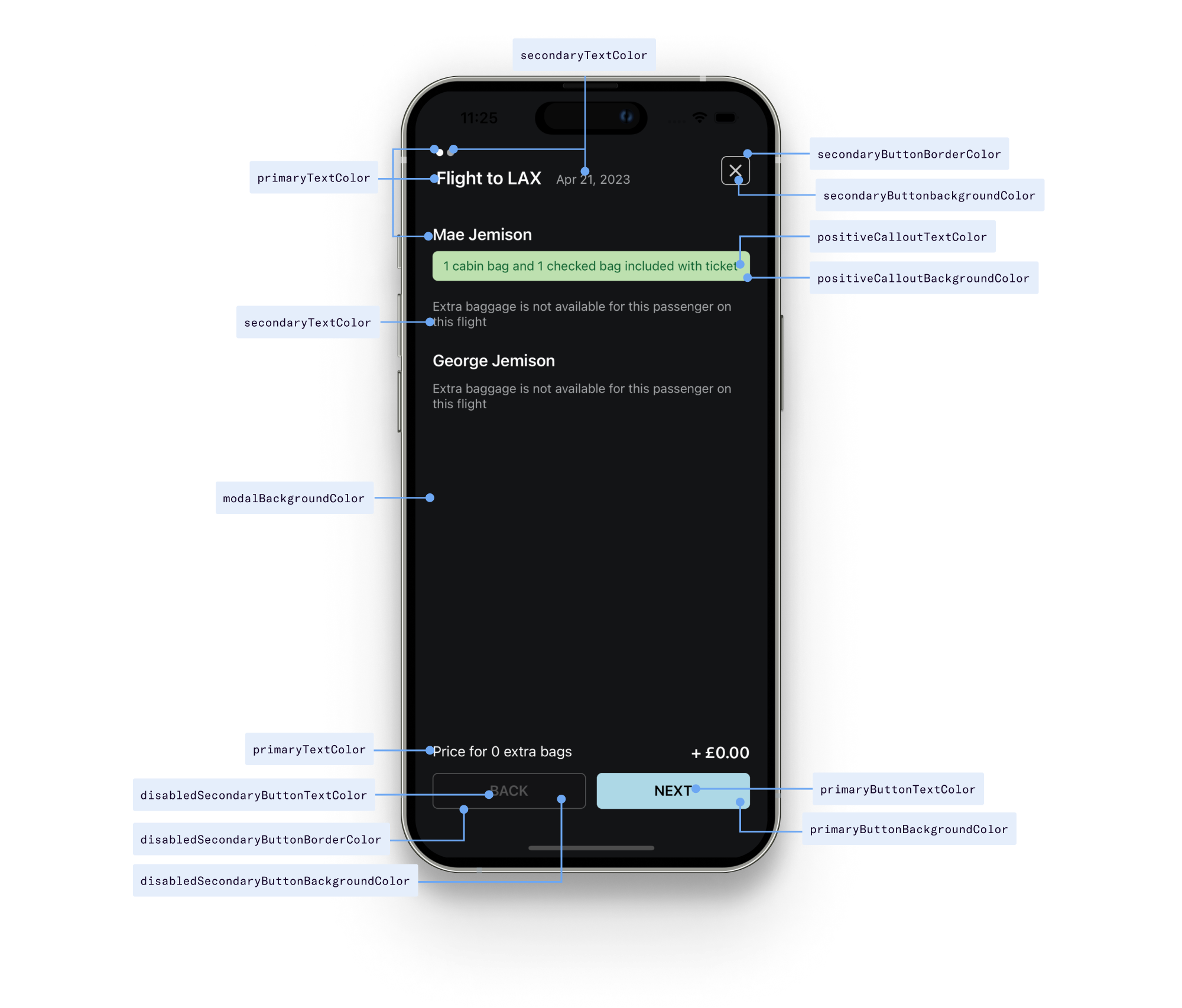
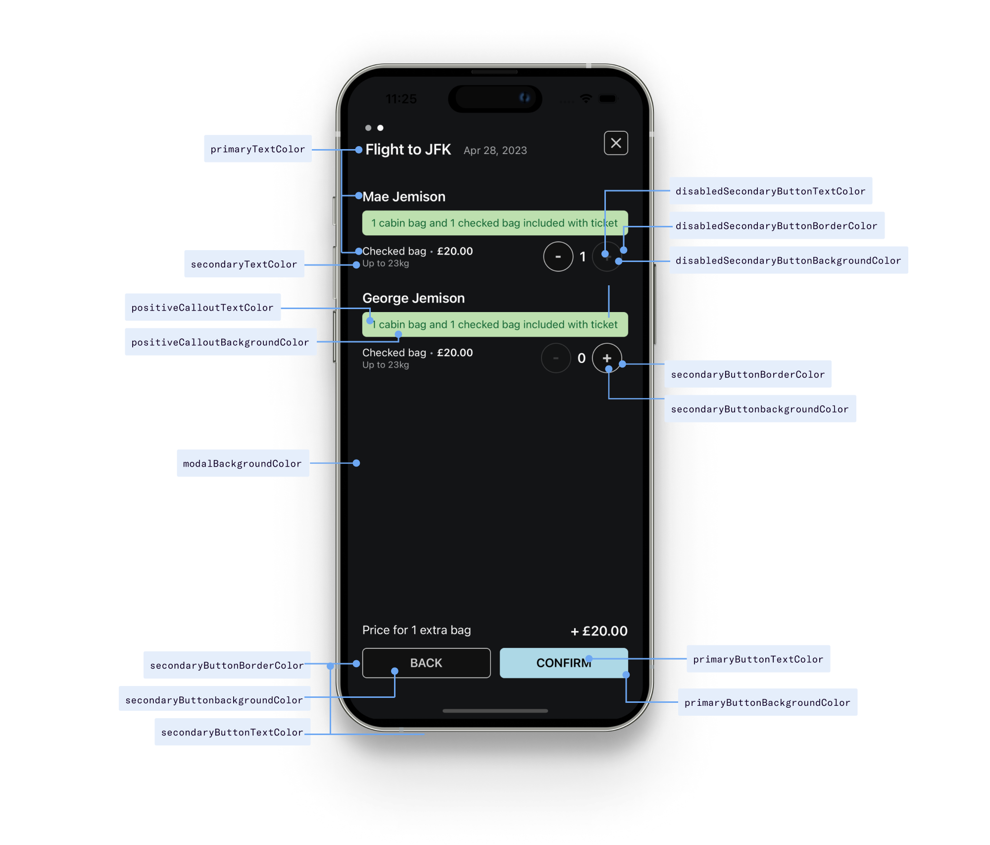
Visual guide
The following diagrams illustrate how each of the theme controls map into the component UI:
API reference
| Prop name | Type | Default |
|---|---|---|
primaryTextColor | string | #1d1d1d |
secondaryTextColor | string | #bbbbbb |
borderColor | string | #cccccc |
cardBackgroundColor | string | white |
modalBackgroundColor | string | white |
tooltipBackgroundColor | string | white |
primaryButtonTextColor | string | white |
primaryButtonBackgroundColor | string | #1d1d1d |
secondaryButtonTextColor | string | #666 |
secondaryButtonBackgroundColor | string | #eee |
secondaryButtonBorderColor | string | #ddd |
disabledSecondaryButtonTextColor | string | #ccc |
disabledSecondaryButtonBackgroundColor | string | #efefef |
disabledSecondaryButtonBorderColor | string | #eee |
positiveCalloutTextColor | string | #106331 |
positiveCalloutBackgroundColor | string | #bde0af |