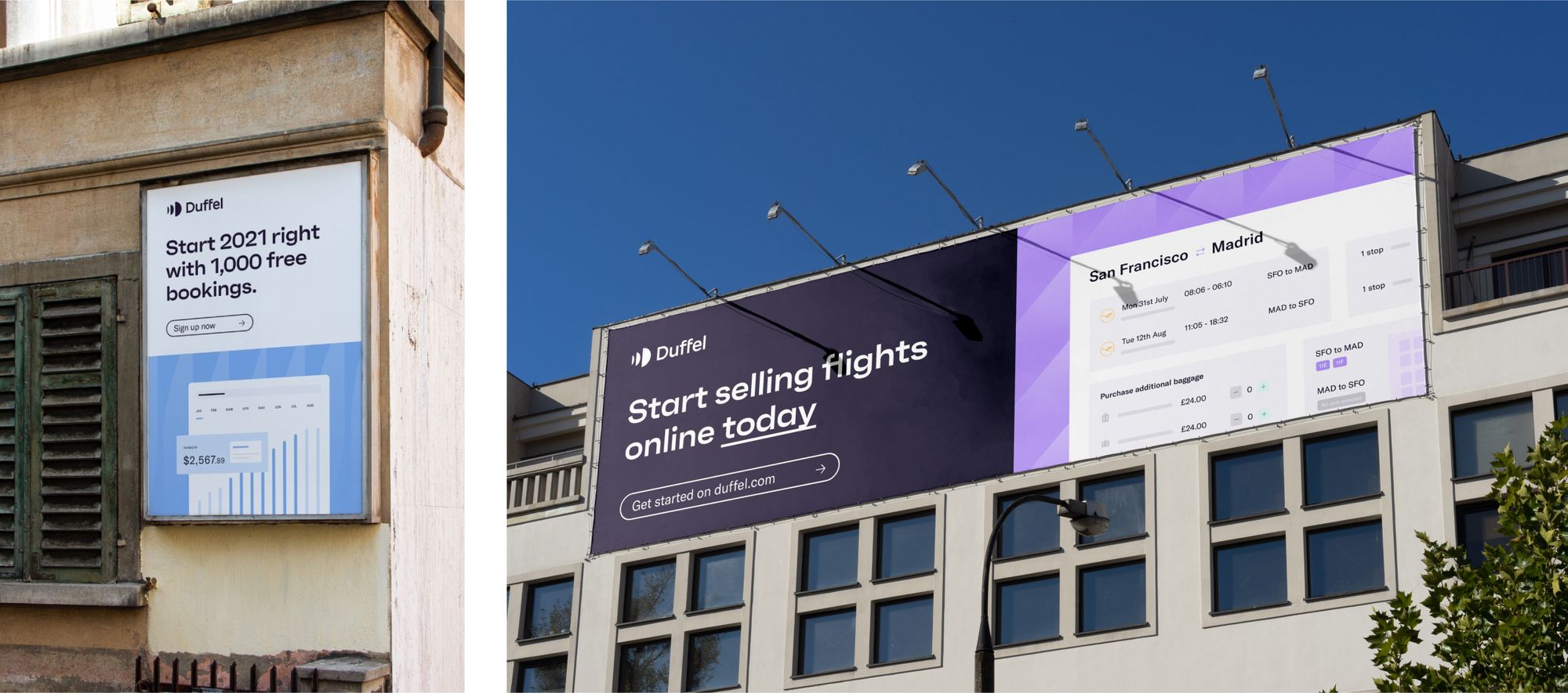
After months of planning, designing, building, testing, and implementation, we are finally releasing the newly refreshed Duffel brand into the world.
Rebrand or Refresh?
To people on the outside of the design world looking in, it’s easy to get confused when these two terms come hand in hand. You see companies evolving, changing, and adapting to the current market, but are they rebranding, or just refreshing?
Though the two terms seem similar on the surface, when you get down to the details, the differences are like night and day. A brand refresh is like giving your company a fresh lick of paint, a new look, and a fancy new logo. Rebranding is all about tearing down everything you’ve built and starting again from scratch – a much more dramatic change.
We’ve had the same branding, or at least iterations of it, since our actual rebrand in 2019 with Koto. There’s no doubt that it has served us well and has provided us with a strong foundation for the look and feel of Duffel today. However, it felt like we had iterated the brand into a corner, and created limitations and pain points including an over-use of dark colours and difficult fonts.
Moving forward, we need to make sure the foundations of our brand are ready for company and team growth. We need our brand to represent who we are today and the value we deliver. And we need more consistency across our product suite with a smoother way of working with other teams across the business.
The work before the work of brand refresh
When you think of branding, most people think logo, colour palette, icons, photography, and typeface. But what about the work that happens before all that? There’s research and foundational work that grounds a brand not just in creativity, but insight and evidence too.
We started working on our refreshed brand long before we looked at anything visual. Step one: complete a brand audit. We took the current state of our brand and dissected and analysed it to figure out how much needed refreshing.
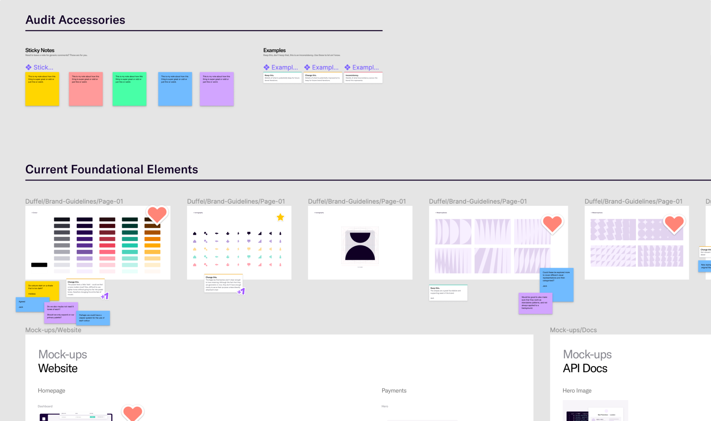
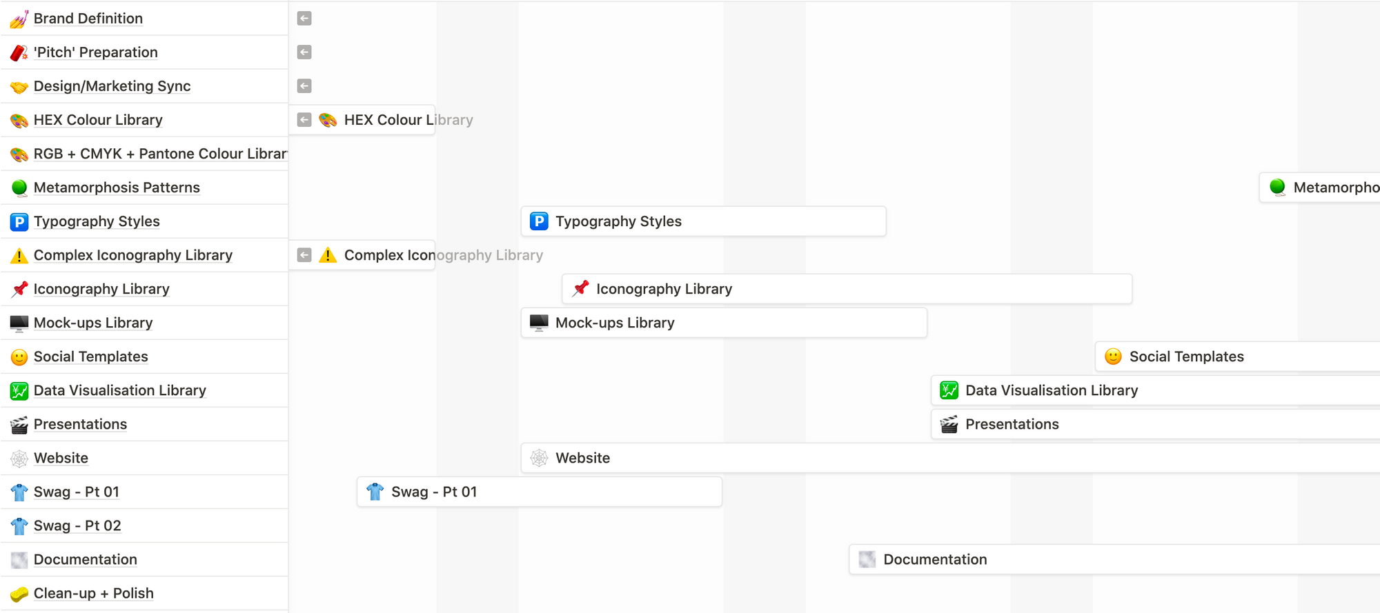
Once we clarified what we wanted to keep and what we wanted to change, we started an extensive planning process. We created a detailed roadmap including the different stages of the refresh process. This was helpful to figure out our priorities as this was going to be completed alongside our day-to-day work and projects. It also included a list of deliverables, stakeholders, and owners per section.
Turning the audit into a plan
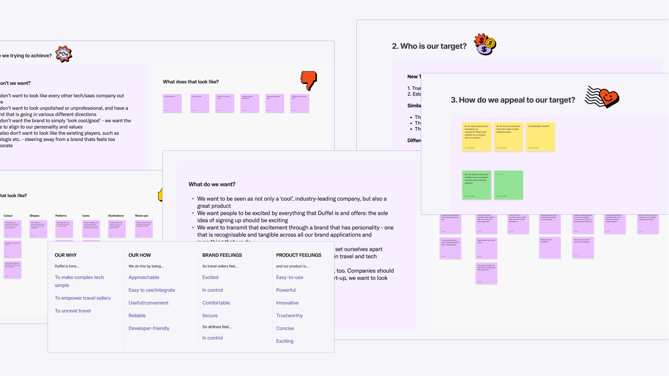
Over a long session with the Marketing team and our CEO, Steve Domin, we worked at cracking the very large egg that is the updated Duffel brand.
We asked a lot of questions: What do we stand for? Why do we want to portray a particular image? How do we achieve a future-proof brand?
A lot of our answers simply confirmed principles that were already established, like our target market, but the session brought a lot of priorities into light that we would have otherwise overlooked. And importantly, it aligned our work and gave us an excellent starting point.
The Discovery and Exploration stages
Once we had completed that initial stage, we set out to apply the learnings to our Discovery stage: essentially a lot of visual research.
We set out to research what our competitors were doing, what other startups and companies were doing, current and future design trends, and what visual elements aligned with what we wanted to portray as a brand.
Once we were happy with the research conducted, we put together a large mood board that would help guide us through the next stage in our work: Exploration.
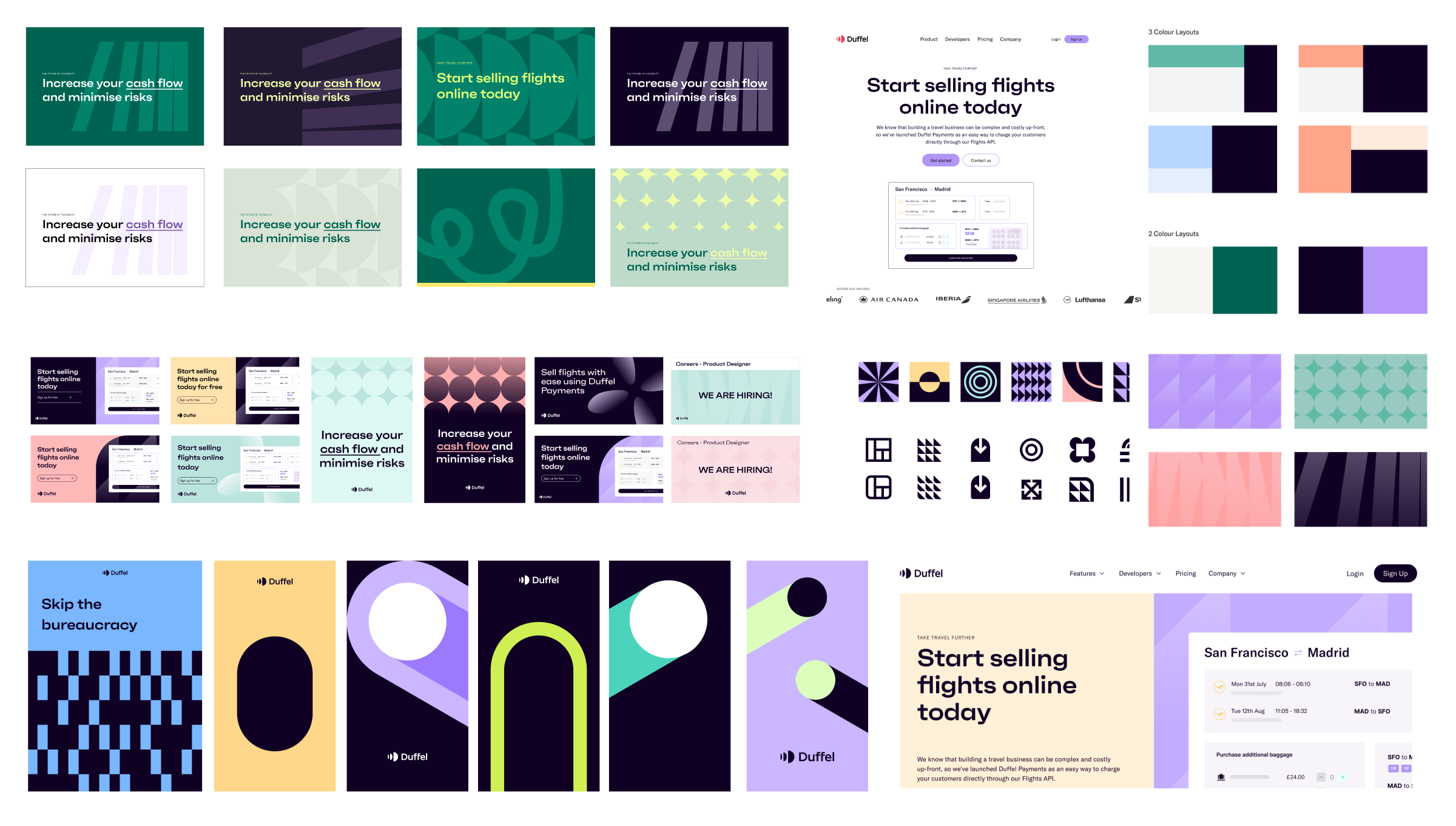
We started exploring how we could apply the research and visual elements to the next iteration of the Duffel brand. We played around with colour, type, patterns, UI, and illustration styles to reach two core directions that we were confident we wanted to explore further.
Pitching our proposals to the team
After this, it was time for the next stage in the process: Pitch Week. This involved our brand team splitting into two teams to work on two different sprint pitches to bring forward to the Marketing team and our CEO, Steve.
Our first pitch was a larger departure from our current brand. It was a more modern and striking style, slightly brutalist and very confident. Our second pitch was closer to our current brand, bringing in more lightness, roundedness, approachability, and polish.
We pitched the two proposals to the Marketing team and asked them to share their thoughts. We wanted to find out which approach better suited their perspective on the Duffel brand, what we were trying to achieve, and whether the designs reflected the company today or a future version of where we want to be.
Once we landed on a direction and decided what we would keep and what would change, we focussed on making sure the visual story complemented our company strategy.
Our brand vision was simple: modernise the brand's visual elements to authentically tell our story. We decided that there were key elements to both directions that we wanted to keep, and brought them together to create a core mood board to guide the rest of the process.
And finally, the design work
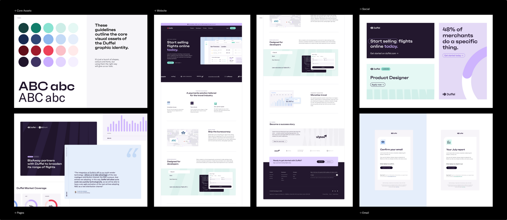
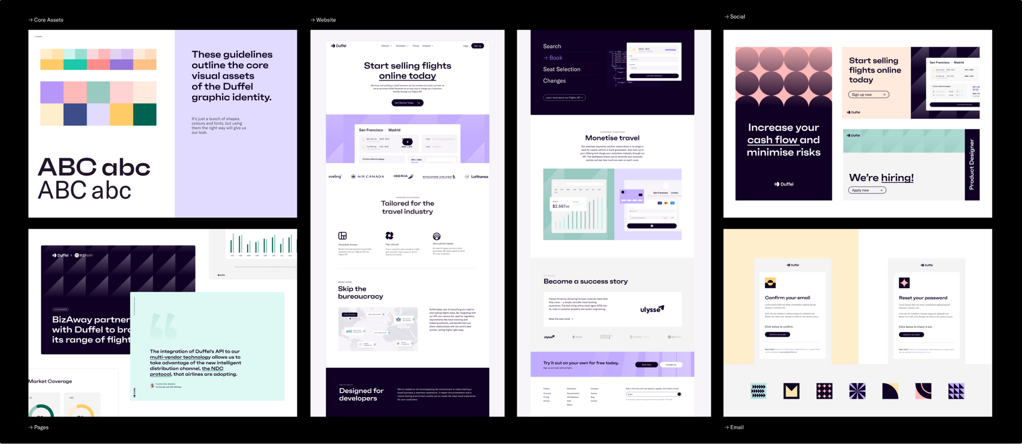
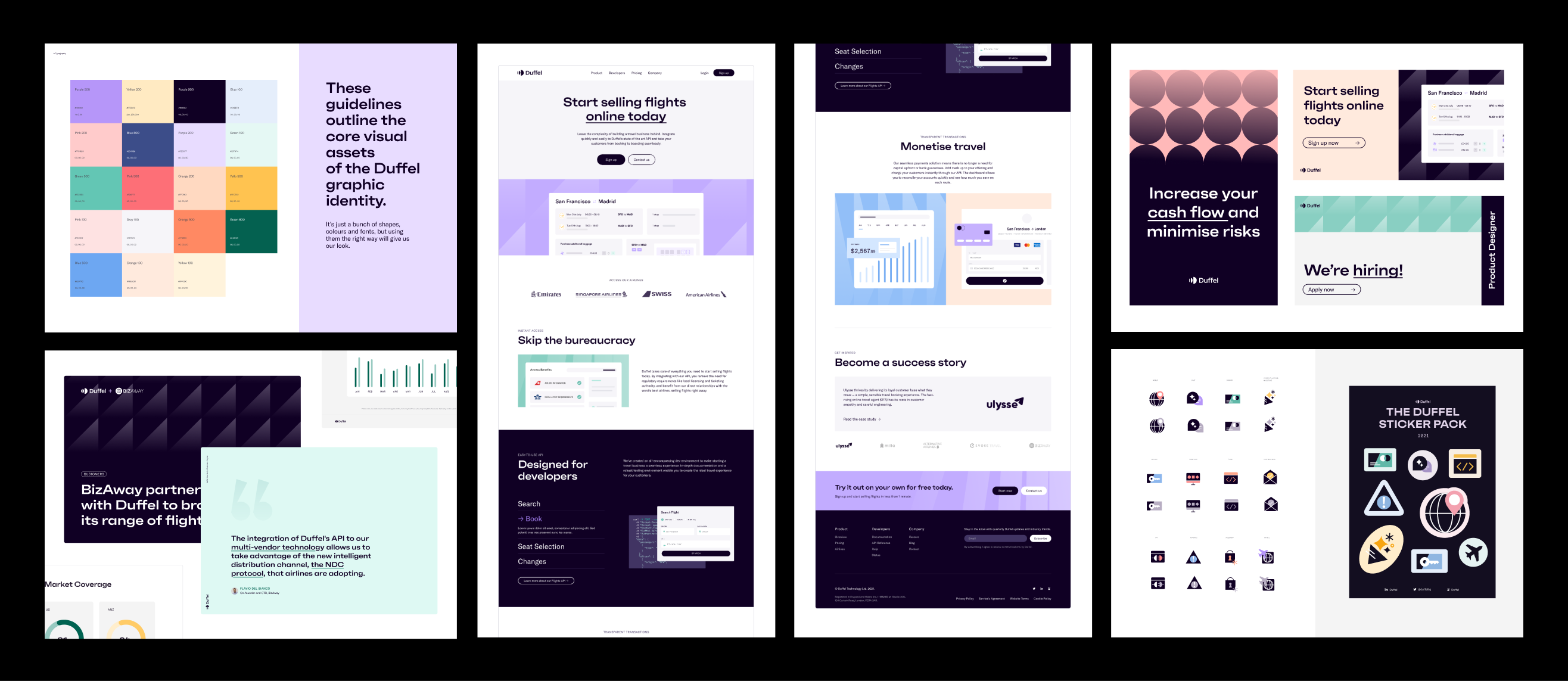
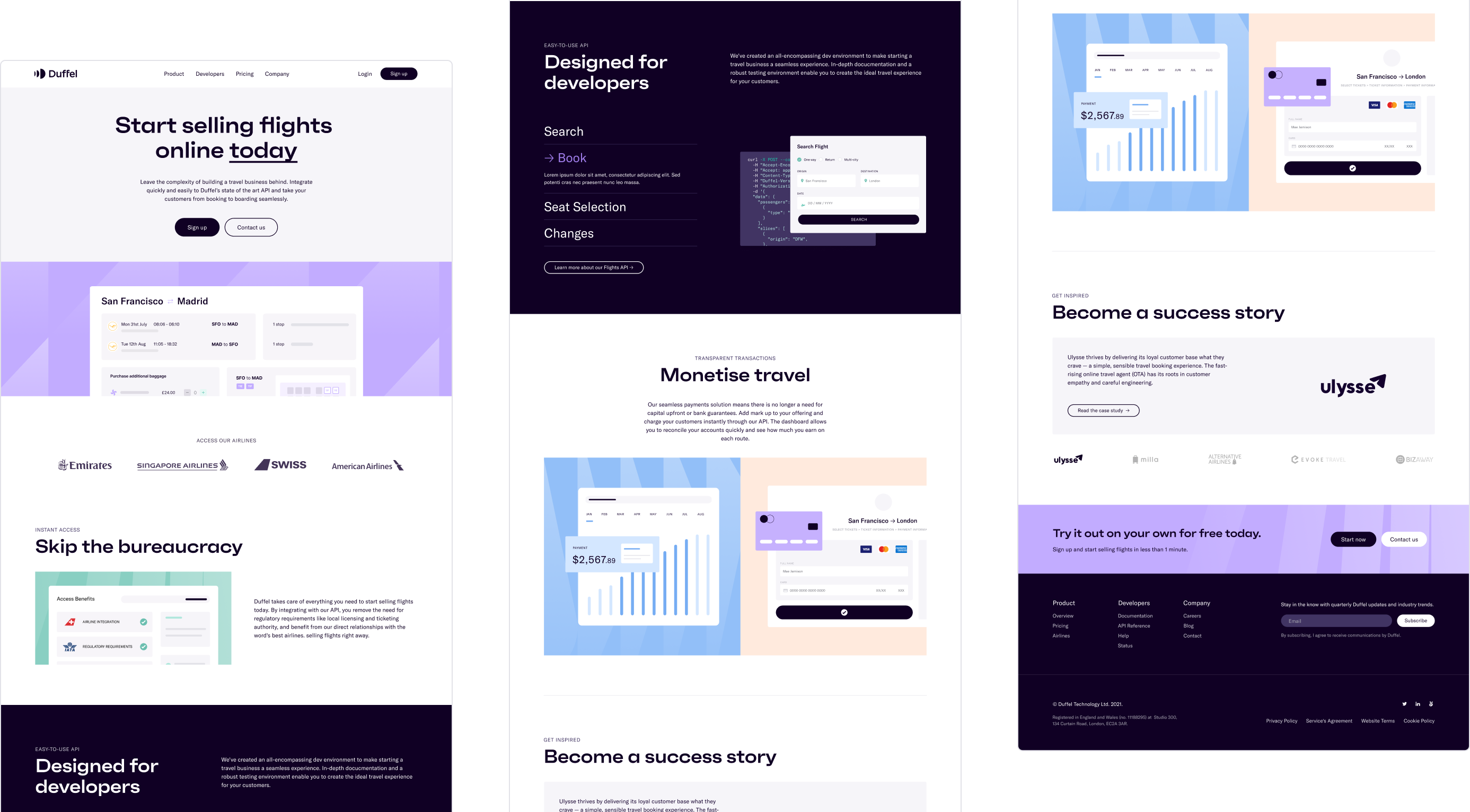
For the rest of the quarter, we followed our roadmap and worked on getting our deliverables across the line. What came first was the foundational work: as stated, one of the biggest reasons behind this refresh was to ensure consistency across brand and product. This meant working super closely with the product team to establish and develop our colour palette, type scale, icon libraries and core patterns, to name a few.
Thanks to our Discovery stage, we had pinpointed current limitations which helped us focus on fixes to improve the colour spectrum, typography styles and iconography to fulfil the needs for our key internal stakeholders: Marketing and Product teams.
We addressed their needs through a lens of engagement and accessibility. For example, when it came to choosing new colours, we landed on a robust and expressive set of shades for a range of marketing uses and a reduced palette for product that are appropriate for contrast and legibility. This was brought together for a shared, consistent design identity.
Let’s get it out there!
Once the design work was done, the implementation stage came next. This also (surprise) involved plenty of planning and collaboration with other teams to ensure our work went from design file to reality.
We needed to ensure we could hit our release window. Working with internal Duffel teams we created an in-depth roadmap with time-frames that prepared for any unforeseen eventualities. Each project was broken down by priority with a plan for what the minimum viable release would look like. This ensured a realistic schedule with a plan for iteration that stretches past the launch date.
The implementation process consisted of several layers, from prepping our Figma files where we broke down each module and provided the granularly to the assets, to design reviews where builds were carefully checked over and comments were labelled clearly. This streamlined the process from start to end – we don’t believe in single handoffs and worked hand in hand with our developers to ensure our vision was realised.
Before releasing the brand refresh internally, we needed everyone at Duffel to understand what we did and why we did it so they could embrace the new visuals. Some things stayed the same and some things changed, so it was important that we shared those first so the broader team could teach others as we went external. We did so by running “deep dives” during our company-wide meetings and hosting design critiques.
The Future: what’s next?
We intend to continue improving on and polishing this work over time. This year we are focussing on not only bringing other elements into the refreshed brand direction, such as new pages on our website, an updated Dashboard, collateral and swag (among others), but also continuing to work the direction itself.
As important and fun design work is, documentation is just as important. We made great strides towards crafting and documenting a shared Design System between Product and Brand design which will have monumental impact on the way that we work together. We will focus on maintaining and iterating on this to keep the brand consistent and polished.
Our work on the brand will continue, but for now the refreshed Duffel brand is live!


Latest posts
Introducing Duffel Cars: one API for flights, stays and now car rentals
Duffel Cars is here. Businesses can now embed car rentals from 40 global providers across 40,000+ locations in 200 countries, alongside Flights and Stays, through the same Duffel API — making Duffel a more complete one-stop shop for embedded travel.

Rippling chooses Duffel to power Rippling Travel
Rippling chose Duffel to power Rippling Travel, bringing flights and stays into its Spend Management suite so employees can book trips easily while finance teams manage travel spend in real time.
Data-Driven Travel: Using Analytics from the Duffel API to Make Smarter Business Decisions
Our latest blog post explores how companies and developers can use this tool to make smarter business decisions. Learn how to leverage booking data, implement dynamic pricing models, and use predictive modeling for future planning.

Introducing Duffel Cars: one API for flights, stays and now car rentals
Duffel Cars is here. Businesses can now embed car rentals from 40 global providers across 40,000+ locations in 200 countries, alongside Flights and Stays, through the same Duffel API — making Duffel a more complete one-stop shop for embedded travel.
Rippling chooses Duffel to power Rippling Travel
Rippling chose Duffel to power Rippling Travel, bringing flights and stays into its Spend Management suite so employees can book trips easily while finance teams manage travel spend in real time.
Data-Driven Travel: Using Analytics from the Duffel API to Make Smarter Business Decisions
Our latest blog post explores how companies and developers can use this tool to make smarter business decisions. Learn how to leverage booking data, implement dynamic pricing models, and use predictive modeling for future planning.